Thursday, December 8, 2011

Portrait Photography - The Final, and the End

It is easy to underestimate the importance of viewing other photographers' work when attempting to develop your own style in the medium.  Some might think that this could only lead a person to copy the work of others, but this is far from true.  Inspiration can come from a variety of quarters, and there is a lot to be said for recognizing the wisdom of those who have gone before you.  I have always believed this, but if anything the process of writing this blog has made my feelings on the subject stronger.  I have seen a variety of ideas, many of which I would like to try out and adapt, many of which I might have glossed over entirely if not for the research behind this blog.  In this, my final post for the time being, I will take a look at two more photographs.  They are of course within the portraiture genre, as that is what I have been examining.

Annie Leibovitz

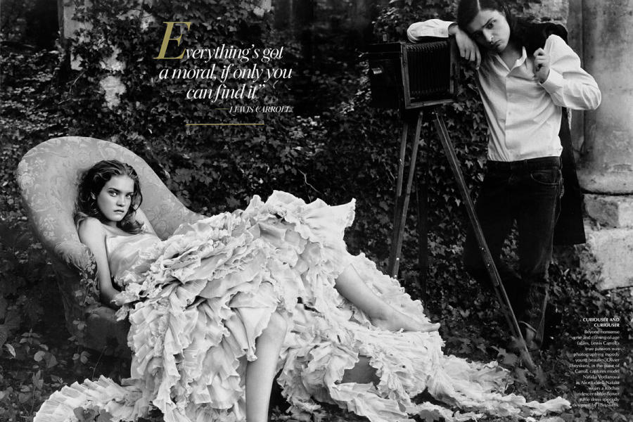
I absolutely love Leibovitz's work.  It has such drama, such story, and yet her work almost always comes out with a somewhat classic look.  Rather, I suppose, I should say timeless.  She has done a lot of famous portraits, all of which seem very distinct from one another.  This grown-up visual interpretation of Alice in Wonderland is very compelling, and draws the viewer in with its texture and tonality.  She also recently did a series of photographs for Disney, all of which are incredibly stylized and pictorially dynamic.  Sure, they are for Disney... but they are wonderful pictures, and are worth a look for anyone interested in photography.

Albert Chong
 
This portrait is one of the best traditional portraits I have looked at during the course of this assignment.  The use of lighting is absolutely exquisite, giving the subject a quite dignity while also making her a most striking character.  The portrait is elegant, and well-arranged.  The subject is slightly off center, which makes her show up even more prominently against the solid black backdrop.  I want to keep this particular look in mind for any straight-forward portraits that I make in the future, because this seems to be a very effective technique.
 
With that, it is time to wrap up this blog for the semester.  Keep on snapping pictures, shutterbugs everywhere.

-Kelly F.

Portrait Photography - Part Four

In this, my next-to-last installment of this Digital Photography blog... I am still going to move on directly to the photographs.  In many cases, the photographs say more in one glance that I can in a paragraph or two.

David Hockney

The image above is markedly different than any others that I have posted on this blog, as Hockney makes use of photo collage and grids to make his portraits and other images.  I will admit that I do not find the end result of this process quite as pleasing in portraiture as I have in other genres of photography, but I think that Hockney has done an excellent job.  It comes out looking like a Cubist work, and certainly provides an interesting perspective on any subject.

Sally Mann

Known for taking pictures of her children before switching to landscapes as subjects, Mann is an interesting portrait photographer.  The above picture is absolutely charming, and the movement of the lower fabric on the dress is very attention-grabbing.  The tonal range of the piece is stunning, but what really makes this photograph special is the focus.  the focus is not on the child, but rather the dress.  It is interesting to keep the focus on what the subject is wearing, rather than the person, creates some separation while still allowing the viewer to feel present in the scene.
 
-Kelly F. 

Portrait Photography - Part Three

Once again, let us move strait into the examination of some wonderfully done portrait photographs:

Duane Michals

On the surface, this images appears to be a lot more simple than several of my last posts.  However, for all that I tend to enjoy complexity and detail, I know the importance of clarity and simplicity.  The skull in this photograph offers a chilling counterpoint to the live man holding it.  If there was a complicated background, or other elements besides the strangely positioned man and the skull, I think the photograph would lose a lot of its power.

Lucas Samaras

Samaras has done many strange and interesting things with his portrait photography, though often the end result is very disturbing,  This particular photograph, like most of Samaras' work, has been highly manipulated.  Much of the artist's work features motion blurring, or another form of hazy, waving motion.  Here, this sets the man's face apart wonderfully, making the viewer focus on the subject while allowing the painterly swirls to play in the corners of their eyes.

-Kelly F.

Portrait Photography - Part Two

Really, should we not just dispense with the pleasantries, and skip directly to the photographs by this point?

Man Ray

Certainly much has been said about Man Ray, and for a good reason.  His portrait photography has influenced countless people, and really represented an interesting shift in the genre.  This image is dramatic, and a good portrait even though this woman's face is not entirely visible.  This is not a documentary shot - it is an emotional portrait, showing dismay and sadness.

Robert and Shana Parke-Harrison

This image, even more so than Man Ray's, uses a small part of a person in order to represent something greater... This photograph falls firmly into the metaphorical portrait category, and is a stunning representative of the genre.  It fairly oozes or drips meaning, and has a very pleasing old-fashioned or antique look.  I plan to explore the Parke-Harrison's work further, as much of what they have done is similar in style.  This type of portraiture is what attracts me most at the moment.

-Kelly F.

Portrait of Photographers and Their Subjects - Portrait Photography

As the title of this blog suggests, the following will be an exploration of various different styles of portraiture in photography.  As it will follow a similar structure to the Landscape assignment, I will go ahead and dive in to the endeavor.

Sebastiao Salgado

Salgado's portraits have such incredible atmosphere that it is hard to look away from some of his works.  Above is one of his powerful images, where he has made wonderful use of the lighting conditions and fog that were around his subjects.  I find this technique admirable because I appreciate the emotional content of the story he is telling.  This is something I have begun to strive for in my own portraits.

Gregory Crewdson

It is not surprising that I have picked the following portrait for this blog, as it is also similar to some of my more recent work in portraiture.  I love the strangeness of Crewdson's setting, and the use of vibrant colors within such a dark space really appeals to me.  Yet it is difficult to understand precisely what Crewdson meant by bringing these flowers into a house, although it does seem clear that the woman is tired or weary.  She seem forlorn, even.  This seems like a photograph that I will have to dwell on for a while before I can truly understand it.  Regardless of this fact, t is still an incredibly compelling portrait.

-Kelly F.   

Lanscape Photography - The Saga Concludes

As this marks my fourth entry on Landscape Photography within the context of this blog, it has officially become a saga.  All good things must come to an end, however, as there are other areas within the realm of photography that must be explored.  So, without further ado I present two final landscape photographs:

Eleanor, Chicago, 1951 by Harry Callahan

This photograph possesses a lot of features that I admire, and try to incorporate into my own work.  First there is the contrast-y scene, which gives the piece a tremendous presence and plenty of atmosphere.  Yet there are still many grey tones that show themselves in the wild branches of the landscape, elements which lend the photograph a feeling of life.  The image in the middle, of Callahan's wife, is probably the result of a double exposure.  Because of this addition to the landscape, the whole picture becomes surreal and fantastic.  This shows that landscape can be used to highlight a completely different scene, and vice versa.
 
Birches Growing in Books, Detroit by Andrew Moore
 
Here we have another variation on the juxtaposition between nature and man-made structures.  The decaying overhang gives way to collection of trees, and light streams around them into the wrecked space.  Speaking purely of formal qualities, I think this photograph features a lovely color palette, and has a very strong composition.  The green-gold light coming around the trees does a lot to balance the cool, dark tones of the ground.  This once again uses the idea of nature taking back over, once an inorganic structure begins to decay.  Here, it seems almost hopeful and somewhat uplifting.  Maybe it is that fresh, green light, bathing the a scene that might otherwise be dismal.


-Kelly F.

Landscape Photography - Part Three

In this blog post I am going to continue examining the work of landscape photographers, and will begin with something that struck a very familiar cord.

Carrara Marble Quarries # 20, Carrara, Italy, 1993 by Edward Burtynsky

I have actually seen a similar if not precisely the same view Burtynsky recorded in this photograph, though I was lucky enough to visit the Carrara quarries many years after he did.  The view around the area is absolutely breathtaking, and this image does a good job of capturing that.  In other photographs in this series, Burtynsky even shows the place in the quarries where Michelangelo mined marble.  Nostalgia led me to this image, but the concept behind much of Burtynsky's work also interests me.  He seems to choose landscapes that have in some way been torn apart - mines, rail lines, etc... yet his images still reveal a certain beauty in these deconstructed landscapes, making his scenes more poignant.

    Blue Mountain Islands, 2006 by John Pfahl

Pfahl's technique in the picture above is quite fascinating, as it really plays with the hanging scroll tradition.  I have always meant to make a collagraph or something like that in a hanging scroll format, of course using landscape imagery throughout my composition.  What interests me about this photograph is that it stretches (quite literally) the original concept of a hanging scroll.  The image begins to distort towards the bottom of the piece, in contrast to some traditional hanging scrolls where such a landscape seems to exist in layers stacked on top of one another.  This is simply one of the most creative ways I have seen a landscape recorded in photography.  The entire notion of a horizontally-oriented composition is thrown completely out the window, and the viewer is faced with a curious, elongated scene.

-Kelly F.

Landscape Photography - Part Two

This is a continuation of the previous blog post, in which I examined the very dissimilar, but equally interesting, work of two photographers.  The first photograph I have chosen to include today obviously has deep roots in the conceptual movement in art.

From The Garden 1 by Pipo Nguyen-duy

This is an interesting twist on the landscape genre - the created, simulated, or adapted landscape.  It looks as though the landscape Nguyen-duy created is inside of a broken, abandoned old greenhouse.  This is but one in a series of photographs he took in this location, each displaying signs of different seasons.  There is a strange juxtaposition of growth and decay in the image - and indeed a subversion of the imagery one would expect to see in a greenhouse.  It is as though nature is taking back over the scene, even if it is artificially arranged to some degree (which it must have been, given some of the features of the other shots in the series).  For all the skeletal elements, there is still nature and vegetation.  The artist managed to create a very intriguing series, one which I would like to research further in the future.

Terre Rouge, Esch-Alzette, Luxembourg 1979 by Bernd and Hilla Becher
 
In keeping with the theme of non-traditional landscapes, this photograph caught my attention.  What first drew me to the piece was the geometry it contains.  I have an affinity for interesting composition and arrangement, and often find that there are either vaguely or entirely geometric elements in most of my best photographs.  So, the way that the photograph reveals the geometry of this structure speaks to me.  However, if it did not seem to be an organic structure, I would not find it nearly as interesting (or necessarily call it a landscape).  Yet it does seem to swell and twist like vines or some strange shrub, growing up towards a sky that is barely visible behind it.  In this photograph the artists did a wonderful job of comparing the industrial scene to the landscape which may have been destroyed by it.  Such conceptual work, where something inorganic serves as a landscape, often makes for an interesting work.

-Kelly F.

Lanscape Photography - Part One

Once again, the Digital Photography class has been asked to work in a series - this time, in conjunction with our own exploration of landscape photography we will be reviewing the work of those working in the genre.

Winter Sunrise, from Lone Pine by Ansel Adams

What can one say about Ansel Adams that has not been said before?  The man was a master of landscape photography, and is probably the best known photographer of our times.  It is easy to see where his fame comes from, as his images are simply gorgeous.  His Zone System ensured that he got the best tonal ranges possible, which is one of my favorite things to see in a black and white image.  Granted, I do tend to like contrasty images... However, I like to have small areas where grey tones make themselves known.  Also, I like the peaceful, very still feeling that most of Ansel Adams' work evokes.  It is very beautiful and calming to observe.

Bernheim Arboretum, Kentucky (4-08-24c-8), 2008 by Lynn Geesaman

I find this work, like much of Lynn Geesaman's photographs, incredibly inspirational.  The technique gives the photograph a very painterly feel, lending the landscape a very romantic air.  It honestly reminds me of some of my favorite paintings by Waterhouse.  The whole scene seems to glow from within, making this a vibrant and captivating piece.  I would like to try something similar with my own landscape photographs, but I would like to find a process that is original.  I know that this is a difficult task, but I have the right to dream.

-Kelly F.

Placing Products on Pedastals - Product Photography

For all the evil that is ascribed by some to the world of advertising, it is good to remember that there are honest people doing honest work in the industry.  Everyone has to make a living... Some photographers work in a studio setting with various products, creating images that will eventually find their way into advertisements or some such arena.  Indeed, product photography can be a fun and challenging field, especially if there is a concept behind the shots of the product.  The following are some good examples of product photography done well.


Without wanting to get into the problems surrounding the diamond trade, I decided that the above was a good example for this blog.  Some might find my choice of the Tacori diamond ring ad above strange, but there are a variety of reasons that this is a good product photograph.  Granted, it looks like it was manipulated at least to some degree in Photoshop.  However, diamonds are incredibly hard to photograph well.  Anything reflective, really, has the potential to send your studio lights everywhere and just generally not look this brilliant.


I would not ever call myself a car person - all I have ever wanted was a nice, four-door Volvo sedan... And as this photograph clearly shows, a Volvo sedan can be a gorgeous car.  The lighting on the car is wonderful, and it does not suffer the toy-car syndrome that seems to afflict some car pictures (due to the removal of anything giving a sense of scale.)  On the whole, this is a really good photograph of a large product.


Normally I would say that a product picture fails if a viewer is not entirely clear as to what the product is, but for these things I just do not care.  They look incredible - I think they are some designer vase design from what I could tell, but I could be wrong.  The important thing about this photograph is that it is dramatic - it draws the viewer in, and makes the product incredibly interesting.  Sometimes, drama is the best way to makes sure that people will investigate and eventually buy a product.

-Kelly F.

Still Life Photography - Part Three

There are two more artists to look at in this, the final installment of my exploration of still life photography.  The styles examined previously are varied and interesting, and those of the following artists continue the trend.

Ruth Thorne Thomsen:

Duet, Wisconsin
 
Turrita Mater
 

Sandy Skoglund:

From The Power of Imagination
 
From The Power of Imagination
 
These imaginative, creative photographs - as well as those in the two previous segments of this blog series - are truly inspiring to anyone thinking of working in the still life genre.  It shows that the possibilities of what one can do with objects are limitless.  The photographer's job is to sort out the best style and arrangement for a given concept.
 
-Kelly F. 

Still Life Photography - Part Two

This is the second installment of my Digital Photography class assignment to post picture created by well-known still life artists.  When the previous blog left off, I was examining the work of Jan Groover.  Therefore, this is a perfect place to pick things back up.

Jan Groover:

Untitled, 1979

Untitled
 
Olivia Parker:
Replication
 
 From Visual Truths Series

Zeke Berman:

Maple Branch, 1983

Fog Lamp, 2004

Patrick Nagatani:

Bentley, Stonehenge, Salisbury Plain, Wiltshire, England, 1987
 
Trinitrite Tempest, 1988

-Kelly F.

Still Life Photography - Part One

In this three-part blog, our class has been asked to post 18 Still Life images over the course of three weeks, all from the work of the following photographers: Irving Penn, Edward Weston, Jan Groover, Olivia Parker, Zeke Berman, Patrick Nagatani, Ruth Thorne Thomsen, and Sandy Skoglund.  As far as I can tell, we were not asked to write aout why we chose them, but rather to simply post them.  Going along with the theory that a picture is worth a thousand words, I will allow these photographer's works to speak for themselves.

Irving Penn:

Ballet Theater, New York 1947


Ballet Society, New York 1948

Edward Weston:

Lake Tenaya, 1937


Nude
 
 Oceano, 1936


Jan Groover:

Untitled, 1987


More from Jan Groover next time...

-Kelly F.

Tuesday, December 6, 2011

Shutter Speed Images

What?  I could not for the life of me come up with a witty, creative title for this particular blog post.  The following are examples of what manipulating the shutter speed of the camera will do to a photograph. 


This is an excellent example of using a high shutter speed to freeze motion, in this case of water splashing when an ice cube is dropped into it.  The reason I chose this photograph is that the color scheme shows off the power of freezing motion.  It is a simple black and white image, yet this only seems to make the elegant stream of water more poignant.

This photograph was created by using a slow shutter speed, and then twirling around some source of fire or light.  I chose to include this in my blog because it communicates such a vital energy.  The sense of motion is understandable given the technique, but it is still powerful.


Tracking shots, where one follows the movement of an object or a person, are far more difficult than one might think.  I have tried it several times, and therefore can truly appreciate this particular photograph.  It is an excellent example of a tracking shot.

-Kelly F.

Going Deeper - Images with a Limited Depth of Field

The following are three images, each displaying how a shallow depth of field can enhance an image, or at the very least make for an interesting composition.  Also, there is an example of how a wide aperture can be misused.


This photograph is a perfect example of what a shallow depth of field can do for a photograph.  The mushrooms in this picture seem to be something beyond ground cover - they are dramatic, standing apart from their blurry, out-of-focus counterparts.  This technique grabs the viewer, telling them that this is important subject matter that deserves their attention.  This works, even if the subject is a collection of fungi.


This picture also uses a shallow depth of field, but not quite to the same pleasing effect as in the image above.  Let me be understood - this image is alright... It's just not quite to my taste.  The reason for this is that it is almost a little difficult to look at.  The effect is interesting, but perhaps would work slightly better with something other than concrete.  Again, personally, I find it hard to look at the image with it blurred to this extent and in this manner.


It is not as though the overall grey cast to the concrete image is what I dislike.  This image is a perfect example of what shallow depth of field can be used for - making a small, interesting detail the focus of a composition.  I chose this image primarily because of the color scheme.  If the background was not out of focus, then the metal ornamentation would not show up.  However, since the spirals are the only thing in focus, they are wonderfully visible.  This is merely one of the many ways to use shallow depth of field to benefit an image.


-Kelly F.